User Research
UX design: Wireframing, prototyping
UI design + Iterations
Responsibilities
Design Sprint
Group of 3 project
A project dedicated to the redesign of #endchildfoodpoverty campaign website
Project Context
The Problem with the current Website
The #enchildfoodpoverty campaign aims to inform, educate and show visitors how to support the campaign by donating to the cause.
However, when we visited the website, there was difficulty understanding the campaign's objectives and how we could easily donate to show our support.
A Solution for the Website
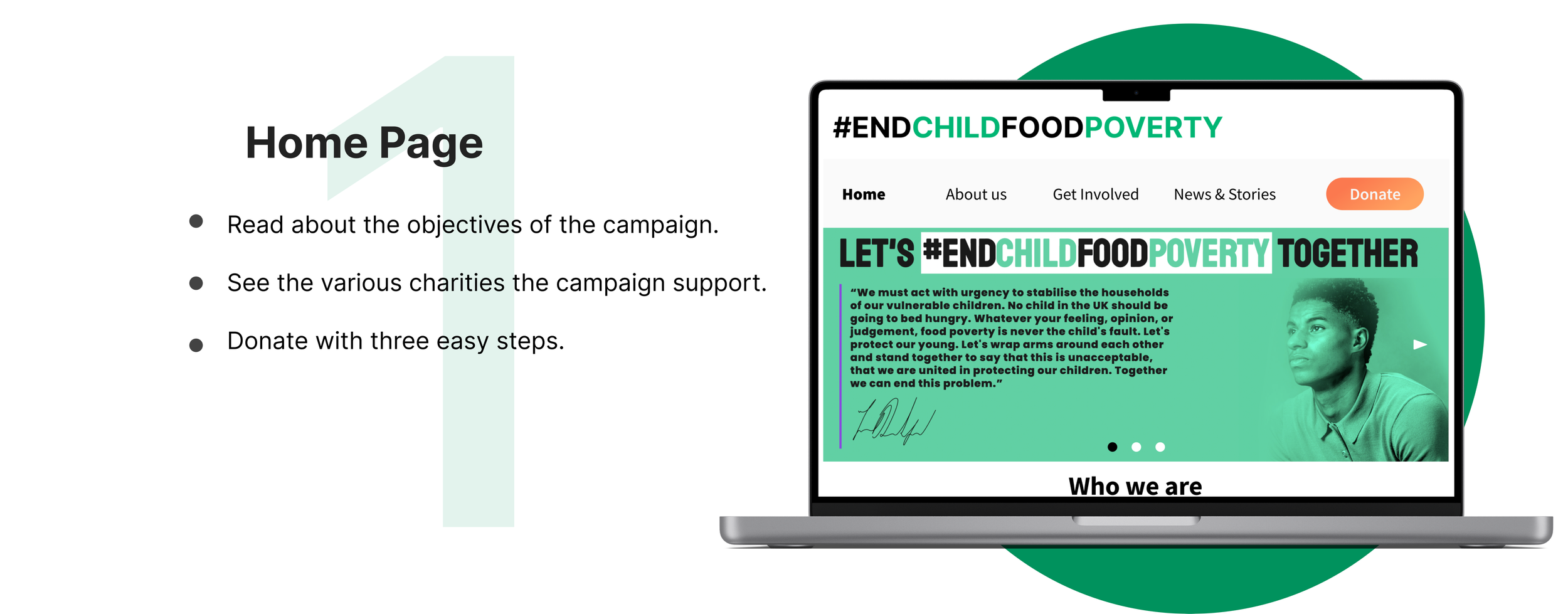
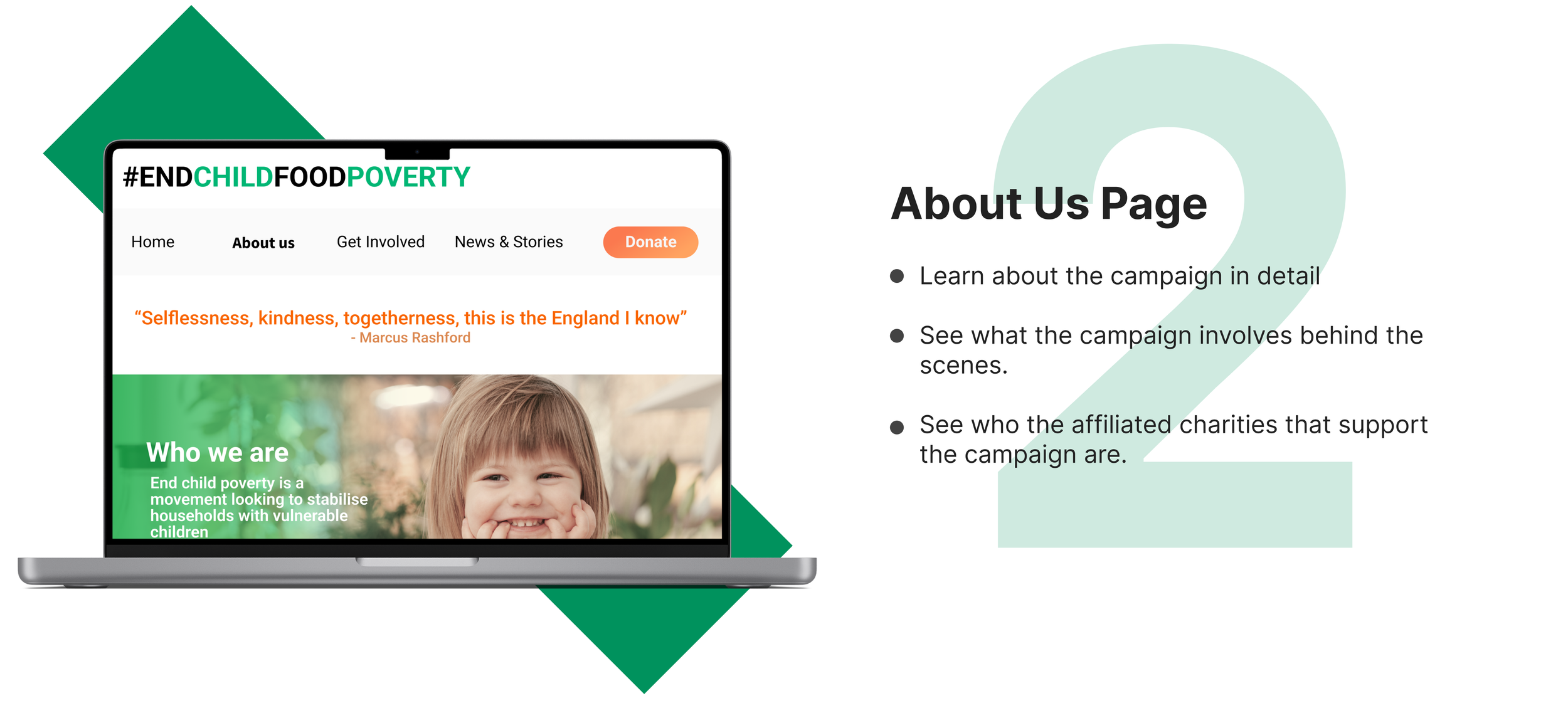
A website where visitors can easily see and understand the whole campaign from the landing page.
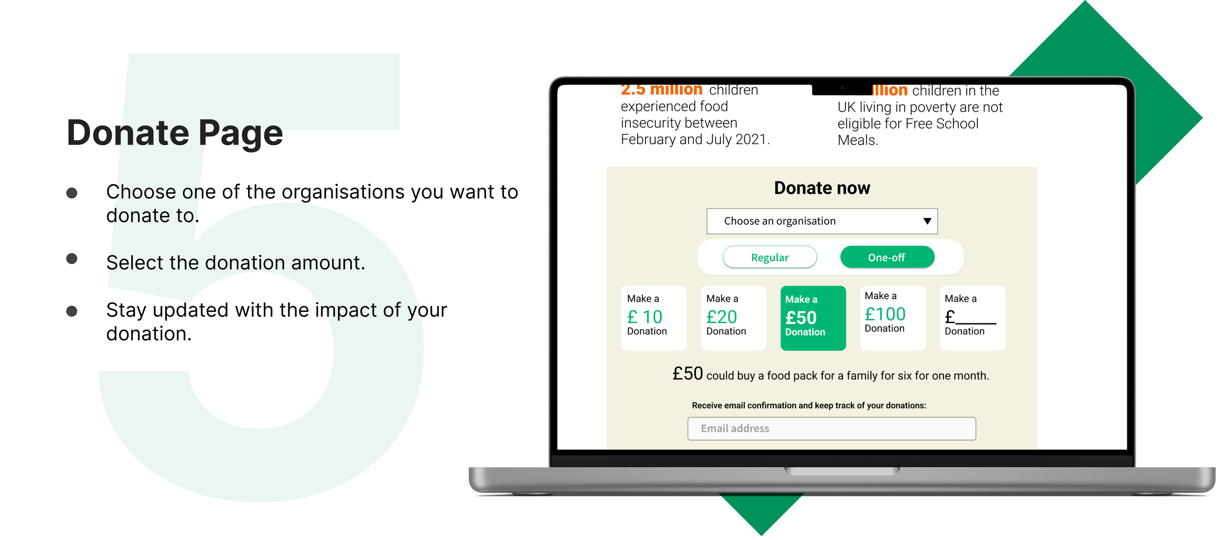
Then provided they wish to donate, have a page to see who benefits, the children’s stories, more about the campaign, how to get involved and a clear donate page.


DAY 1: UNDERSTANDING THE PROBLEMUse the website to make a donation
Initially, we as the group tried to carry out the primary goal of the website, which was to donate to support the cause as the campaign required funding from the general public. We interviewed 9 people to hear about their experience with donating on the website.

Based on the interview responses we received, we found it was a matter of clearly displaying the children affected by food poverty, as well as a clear donation page in order for the viewer to complete the task.
These were some of the questions we asked:
What inspires you to donate?
What influences whether you donate again?
If you could improve anything in the donation towards food poverty charities space, what would it be?
Where would you go if you wanted to donate?
What do you like about this website? Dislike?
Are you able to find the donate button easily?

DAY 2: COMING UP WITH IDEAS AND SOLUTIONSIdea Brainstorming
The campaign's aims were met with slight confusion, as many could recognise Marcus Rashford and wanted to support to cause. However, to donate, the interviewees suggested adding the children's stories, a page about the organisations, and a clear donate section for them to support.
DAY 3 + 4: DECIDING + PROTOYPINGLow-Fidelity Wireframe+ Visualizations


A clear donate page
DAY 5: ROUND OF TESTING AND IMPROVEMENTSOn the last day of the sprint, we did some user testing with 3 people to test the functionality and clarity of the prototype. Overall, the feedback was very positive! Only a few UI changes came about:
The box for stories so far was a shade of green that was off-putting, hence the change to a lighter tone of lilac.
The donation section was clear to understand, but we added a donate button at the bottom of the page to make it easy for the visitor to donate at the top or the bottom of the page.
People wanted to see clearly how their money was being used So we made it transparent on the donate page.
Final Prototype with added revisions
Several minor changes were added to the the final revision.
DAY 5: PRESENTING OUR REDESIGN Reflections:
Good UI helps get a message seen. Maintaining consistent UI helps a visitor comprehend the message the campaign is trying to get across. Therefore keeping fonts consistent, and information hierarchy easy to follow is essential.
Experiencing the problem first-hand is the best research. Experiencing the site as a visitor put us in the shoes of a user. See the problems from their point of view.
Overall, I hope to take the lessons learned in this project towards more cohesive and consistent design in future projects.
Ps: If you are viewing from mobile, please open with desktop to view the prototype & presentation file in full.
For more work inquiries, or to grab a coffee do email me at klaudiakercova@gmail.com ☕️✨
Thank you for reading! 🧠